Now Reading: Google G Icon Redesign: A Decade-Long Wait Ends with AI-Inspired Refresh
- 01
Google G Icon Redesign: A Decade-Long Wait Ends with AI-Inspired Refresh
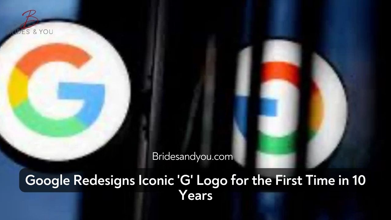
Google has officially unveiled a long-awaited update to its iconic ‘G’ logo — the first major Google G icon redesign since 2015. The tech giant has rolled out this revamped logo just ahead of its highly anticipated I/O 2025 developer conference, setting the tone for its AI-driven future.
This new version of the ‘G’ icon features a bold departure from the traditional solid blocks of red, yellow, green, and blue. Instead, the updated logo embraces a smooth gradient transition between the four signature colors, reflecting a more fluid, modern, and forward-thinking brand identity. The updated design is now live in the latest Google Search app beta (version 16.18) on both Android and iOS platforms.
What’s New in the Google G Icon Redesign?
The newly unveiled Google G icon redesign introduces several subtle yet impactful visual changes. The hallmark shift is the use of gradient colors that provide depth, vibrancy, and a sense of movement. This design aligns closely with Google’s evolving identity, emphasizing innovation, artificial intelligence, and connected experiences.
The last major update to the Google logo occurred in September 2015, when the company introduced its Product Sans font and transitioned from the lowercase ‘g’ on a blue background to the now-familiar capital multicolored ‘G’. This new redesign marks a similar milestone — one that signals Google’s next era led by AI technologies like Gemini and other smart innovations.
Why Now? The AI Connection Behind the Redesign
The timing of the Google G icon redesign isn’t coincidental. It’s part of a strategic shift toward unifying Google’s visual language with its growing emphasis on AI and cross-platform integration. As generative AI continues to dominate the tech landscape, Google is aligning its aesthetic to reflect its leading role in this evolution.
The redesigned icon acts as a visual representation of Google’s transformation. By adopting a gradient aesthetic, Google is subtly communicating fluidity, adaptability, and technological sophistication—values at the core of its AI vision.
This branding refresh is not just cosmetic—it’s deeply symbolic. It’s Google’s way of saying, “We’re evolving with the times—and leading the charge.”
What Comes Next for Google’s Visual Identity?
At this point, the redesigned ‘G’ icon is exclusive to the Google Search app and its homescreen appearance on mobile devices. Google has not confirmed whether this new visual style will extend to other product icons such as Chrome, Maps, Gmail, or Drive.
There’s also no word yet on updates to the main six-letter “Google” wordmark or other brand elements, but speculation is high that more changes could follow after I/O 2025.
Given Google’s history of periodically updating its visual identity to align with major technological pivots, it’s very likely we’ll see broader changes roll out across its ecosystem in the months to come.
Conclusion: A Fresh Look for a New Era
The Google G icon redesign is more than just a facelift—it’s a signal of the company’s deep commitment to embracing the future of AI. With this refreshed logo, Google is not only keeping its look modern but also creating a cohesive identity that reflects its ambitions in machine learning, smart products, and immersive user experiences.
As the tech world gears up for the big announcements at Google I/O 2025, this branding update serves as a stylish preview of what’s to come.
Stay tuned for more updates as Google continues to reimagine its brand for the next digital era.